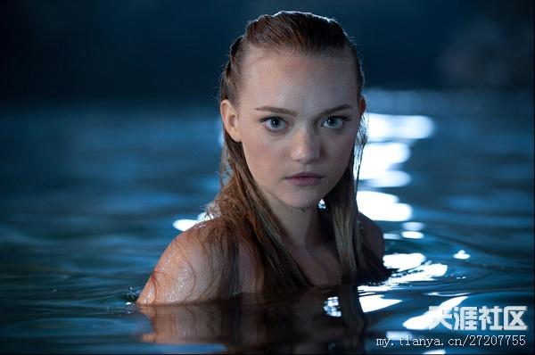
I was watching the "Pirates of the Caribbean 4" has been obsessed with that just played a mermaid. I later checked her information, Her name is Gemma Ward. But no other pictures in the movie is so stunning. I take the thanks to the film's color.
In the movie, her alongside the boat in the sea midstream.Because of the relationship of the light, to see on the screen that the partial upper skin is pale yellow.Especially dazzling in dark blue large sea.Few yellow skin part in the lens, is a sea of blue tone.It is because of the proportion of the quarter, the focus of the audience focus on the role.
Accounted for one-third of the proportion in this picture yellow skin.Also the same principle.But a quarter of yellow is better.
Quarter of yellow, the fifth red roses, there is a large area of Rose White.The site is all the same warm color photography bland.
Each color brings the visual emotions are different.
Red gives a festive feeling of passion, violence, flirtatious. Global warning signs.
Yellow is a bright color, yellow, and orange is the main color in autumn, can arouse strong feelings. Psychology that the yellow dominated joy.
Blue is the color of the sky. Water surface mapping skylight, usually blue. Blue covered with our planet. From space, the Earth is a blue planet.
The blue color is humble, and to convey the feelings of quiet and passive.
So the proportion of the main tone of the picture on the picture effect plays a decisive role.
Illustrator painting with contrasting colors. However, the main color is yellow.Blue only a small part.Yellow is the color of autumn.So the whole picture has the feel of an autumn fairy tale.
Illustrator ideas, and on a picture of the main color is blue.Blue kind of peaceful feeling.The whole picture is like a peaceful morning.
The color is very easy to think of aesthetics. It comes to beauty, and beauty is woman's nature. In fact, makeup is an amazing thing, like face painting. The use of contrasting colors make-up can feel refreshing.
The set makeup contrasting colors of red and green, in red main color.Red enchanting meaning set makeup is more suitable for the party or nightclub.
There are a group of people can be pretty
contrasting colors.Because these people
studied art.
Saturation
Value
hue
Indispensable use of colors.
Reduce the saturation of the
contrasting color is a good idea.
Or decrease the contrast
of color on one
of the area.Can reflect the effect of the finishing touch.
Max
Mara 2011
Mature Opinion (Illuminus
remix) - Kenichiro Nishihara; Daichi Diez
Dreams - 大橋トリオ
These two illustrations are album covers, album cover carries the task
to attract customers to the line of
sight.These two illustrations were
used a lot of contrasting colors.If make
extensive use of the picture a
group of contrasting
colors make people feel uncomfortable.However,
if multiple sets of contrasting colors
used properly, can attract the vision of
the audience, they will not be
very jarring.
In photography, tints and shadows is
essential.Affect the quality of
the work between
the proportion of the use of properly.
The above two photographs are of
the same a model: Natalie Portman.However,
the first DIOR
advertising photography is obviously even
greater concern than the second picture.Proportion of tints and shades in the
first picture is very
appropriate.Seemed full of fashion sense.
But the second pictures tints ratio.It
is not enough to impress anyone.
This is “UP” character design. Tints and
shades make character more vivid.
Compare
with without tints and shades character design, have tints and shades make
picture more mature.
Different character
attributes also determine the
character design. For age people, shaded to
make the characters feel age.